
By Brad Shorr
 Having a mobile-friendly website has become critically important for all companies, and this certainly holds true for those in the luxury ground transportation industry. Mobile internet access now exceeds desktop access, and the gap is widening. It’s possible you’re already getting more mobile traffic than traditional desktop—business travelers live and die by their phones—but if new mobile visitors have a frustrating experience on your site, they are unlikely to become clients. Here are some tips to make your website mobile-friendly and build your base of loyal clients, rather than let it dissolve.
You’re in a mobile business—having a great mobile website will do nothing but add to your credibility!
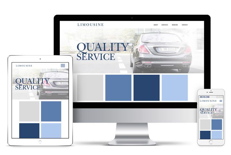
Choose Mobile Versus Responsive Website
There are basically two ways to get a mobile-friendly website: Build a separate website for mobile display or create a responsive website with pages that automatically adjust for any size screen.
For a transportation service, responsive design is the way to go: A separate mobile site means your business will have to update and maintain two websites, which adds a lot of cost—and worse, will often confuse clients who visit your site from desktops and mobile phones. Separate mobile websites (or mobile apps) make more sense for e-commerce companies with a vast number of products for sale; for them, the differences in the amount of content and layout between desktop and mobile display are too great for a compromise, responsive-design solution.
Responsive design may be quite simple to implement. If your current site is built on a content management system (CMS) such as WordPress, it could be as easy as installing a responsive template and making a few design tweaks.
In cases where the current website is not easily adaptable to responsive design, you may be forced to rebuild your site or make heavy modifications. Even if this is the case, the stakes are high in terms of your site’s ability to generate leads and maintain client relationships.
Important Design Issues for Mobile-Friendly Websites
If your site is older or was built for desktop use, chances are the layout will not be ideal for mobile viewing without some changes. There are some important things to consider when transitioning to a responsive site.
• In the mobile view, the phone number should be represented with a phone icon locked at the top of the screen, which should also have click-to-call functionality so mobile visitors can call you with one or two quick taps. Don’t make them hunt for the number.
• Images need to be sized properly so they display on the mobile phone screen without the need for vertical or horizontal scrolling. If your images were originally designed for desktop viewing, they may be too large and will have to be resized. Operators love to show off their fleets, so make sure your images are optimized for mobile viewing. If your site does not currently have a lot of graphics, consider adding some to beef up the persuasive power—mobile users are attracted to visual content, so professionally shot photos of your vehicles will always be enticing to potential clients.
• Text layout for mobile view should be broken into short paragraphs—even more than what is appropriate for desktop viewing. Mobile users are comfortable with vertical scrolling for text but if they are staring at a long paragraph, they may be too impatient to plow through it. Breaking up text with frequent subheadings helps visitors scan.
• Navigation must be exceedingly simple. A common approach to mobile navigation display is to use a “hamburger” menu icon locked at the top of the screen. This is fine as long as you don’t have too many page selections open when a visitor clicks on the icon. For a limousine service, navigation can be limited to Home, About, Services, Rates, Book, and Contact.
• Forms must be ultra-simple, with fields large enough for easy handling by mobile users. Your chauffeured transportation service may want two forms: one for general inquiries and one for reservations. Make sure to link each form to the appropriate page (e.g., Contact and Book).
Most web designers are moving to a “mobile-first” philosophy, meaning that design choices are made based on the mobile experience rather than the desktop experience.
Mobile First
Most web designers are moving to a “mobile-first” philosophy, meaning that design choices are made based on the mobile experience rather than the desktop experience. This makes sense, because for the most part, if it looks good on mobile display, it will look good (or good enough) on desktop display. Text layout is a good example:
Shorter paragraphs are great for mobile and won’t detract at all from the desktop user experience. Moreover, it’s becoming the norm for all online activity being conducted on a smart phone or other mobile device—especially for business travelers.
You’re in a mobile business—having a great mobile website will do nothing but add to your credibility! [CD0418]
Brad Shorr is director of content strategy at Straight North. He can be reached at bshorr@straightnorth.com.